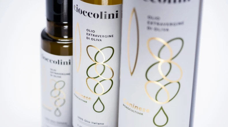
High range wines have refined illustrations, embellished with gold or bronze foils stampings.
Medium/high range wines have Latin-inspired names and minimal and contemporary illustrations to represent elements of the territory.
De Quarto vitivinicoltori
Narrating a territory
Category: Packaging, Art direction
De Quarto wines represent their territory, Magna Grecia. We narrate their stories by giving them a new positioning, new names and a distinctive design.
De Quarto’s family has chosen us to relaunch their brand and their wines. The quality of the products brought to the family many awards thanks to an expertise gained in three generations and high quality local grapes. We have worked on every aspect of the product range, from the naming to the packaging, including a restyling of the brand logo. This was followed by the restyling of the website, in line with the concept and the creative mood.
Read more
Less 

Illustrations are inspired by animals linked to the traditions from which the names of the high range wines are taken.


Nobile and Co' belong to different ranges.
Co', a special wine produced only from excellent crops, is dedicated to the founder, grandpa Cosimo, and takes his name.
Co', a special wine produced only from excellent crops, is dedicated to the founder, grandpa Cosimo, and takes his name.